Friday, December 16, 2011
Habitat For Humanity
This was great community service opportunity! Every other community service project I have been a part of, I have felt like I just wanted to get it over with. However, this one was fun. I like projects where you can actually see your progress right then and there. When we first arrived on the project we got to meet the woman who was actually going to be living in this Habitat House in Uniontown. It was amazing to see her there being a part of her new home being built and that she was working right next to us. This way we could see the people we were helping face to face which made more of an impact on us as the helpers. This project was also fun because it was hands on work. We got to help install the insulation throughout the whole home and used drills to secure the floor boards. This was fun because between the time we showed up and left we could see a huge difference in the home and we knew that we were apart of it. It was also interesting to see all of the materials we had learned about in our Materials class such a windows, electrical cords, and bathroom fixtures, and actually get to use them in the work we did. If I were to become a designer it was also amazing to see how what I would design would be out together by all of the builders of whatever space I were to design. I thought this was a fun and active opportunity that I would love to do again!
Wednesday, September 7, 2011

Wednesday, April 27, 2011


Tuesday, April 26, 2011
Outside Sketch

This sketch was fun because I love nature. This is one of my better sketches and I have seemed to get my shading down better.
Kitchen Still Life

This sketch opened my eyes to objects that may not be expected to be there. This can create a new feeling of the sketch. This is one of my better sketches with better shading than usual.
Value Study in Line

This sketch was difficult for me. Shadowing has always been hard for me and doing it in certain spots was even more difficult.
Chair Negative Space

This negative space chair never turned out how I wanted to. Drawing around the chair was more difficult than I thought.
Black Paper

I liked this sketch. It opened my eyes to different ways of portraying contrasts of color. Even though they are colors you wouldn't imagine, it shows the colors of the hinge.
Figure Tracing from Photo

This sketch was a tracing of a picture which is why I liked it. I accidentally did it with pencil instead of pen and need to work on not doing such scratchy shading.
Figure Tracing

People are very hard to draw for me. I liked the tracing part, but the free hand of the person was a little easier. However, since the picture was right there it was easier to copy it.
Cross Section Fruit

I enjoyed doing this sketch because smaller things such as fruit is easier for me to draw. However, it is hard for me to shade according to the color of the kiwis. It is harder to tell which parts were darker green than others in this sketch.
Room Corner

Because this sketch is at an angle, it was difficult for me. It was also difficult because of all of the different angles of the walls and ceilings. My shading is also off and it is hard for me to know where to shade unless there is light shining in from a window.
Monday, April 25, 2011
Resume

In designing this resume, I realized that it can be interesting yet still easy to read and follow through. By adding just a little personal touch such as my design in the corner, it brightens up the page, yet does not take away from the organizational content of the resume. My name and contact information is still the most noticeable section of the resume.
Monday, April 11, 2011
Logo
This design shows my last name very prominently so it is memorable yet it still tells the viewer what the logo is advertising, Interior Design. It is plain and simple yet spiced up a little bit with little curly lines at the bottom.
Wednesday, February 23, 2011

Thursday, February 17, 2011
Dorm Room
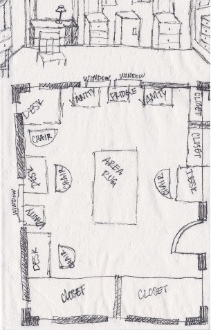 |
| This map was fun to draw to be able to look at my room from a bird's eve view and also looking at the wall from straight on. |
Mind Map
 |
| This sketch was difficult for me. Coming up with words that relate to each other on the spot is hard for me. I ended up coming up with some random words and words I never thought would have come to my mind by starting with the word 'shape.' |
Fruit
 |
| The fruit sketch, being the second sketch of the year, I knew a little more about sketching. We were asked to use cross hatching for this sketch, which is one of the types of sketching I like to do the best now. |
Keys
 |
| This key sketch was the first sketch of the year. Having never sketched for a class before I did not know how to shade at this point. |
Geometric Pattern
 |
| This pattern derived from many different images that were warped, distorted, and contrasted to a totally new form and color. I picked pictures with a lot of texture so there would be more to work with when editing. Putting them together created this geometric patten. |
Monday, February 14, 2011
Textile Pattern
 |
This pattern originated from my Norwegian heritage. The background consists of a textile design from a present day Norwegian designer. The Norwegian shield represents the strength and honor of the Norwegians. The circular flower design is a plate decorated with rosemaling, a Norwegian type of painting. Concept Statement: Although I am many cultures, the only cultural practice my family participates in comes from our Norwegian heritage. This design portrays the Norwegian culture because throughout my whole life, my family and I make a dinner called lefse. We do this every year on Christmas Eve and eat it together as a big happy family just as our Norwegian ancestors would do. The Norwegian Rosemaling on the plate shows the culture of the people and what handcrafted arts they worked on and was a good focal point of the design. The shield was a good element to connect the multiple tiles together which gave the over design its form when all elements were combined. Norwegians specialize in a unique type of painting called “rosemaling,” or rose painting. It is decorative folk art that originated in Norway that displays flowers on wood ornamentation in geometric flowing patterns. Connected to the rosemaling are the Norwegian crests which are coat of arms with a golden lion holding an axe, a blade, and crowned on top. Textile designs were also a strong aspect of Norwegian art. For the background, displayed in the yellow and gray textile is a design done by Norway’s Sari Syväluoma that is eye catching and has changed the idea of textile designs forever. |
Subscribe to:
Posts (Atom)